Mike McKenna and Shelby Nauman recently reflected on the merger journey of how Tabor Community Services and Lancaster Housing Opportunity Partnership (LHOP) officially united to become Tenfold.
When we’re interacting with people and sharing more about our Tenfold team, we’re often asked about our name and what it means. In light of our recent recognition as runner-up in the marketing/branding category of Central Penn Business Journal’s 2022 Nonprofit Innovation Awards, it seemed like a perfect time to share more about how our new Tenfold name and brand was brought to life.
Since Tabor and LHOP were both strong non-profit organizations with prominent name recognition in the community, it became clear during the planning phase of our merger that in order to embrace our new journey together, it was important to change our name so we could identify as one team moving forward.
Our team worked closely with Fig Industries, a local brand marketing and design studio, to navigate a series of extensive exercises and meetings to develop our new name and brand identity. We landed on Tenfold since it reflects the best collective qualities of our organizational roots, while capturing the energy of our new direction.
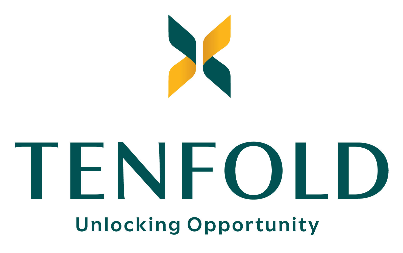
The name Tenfold alludes to multiplication and fruitfulness; a focus on serving as responsible stewards of resources, as an organization, with clients, and through our community partnerships. By working together, we are multiplying our impact so we can achieve sustainable housing solutions and financial security for generations to come.
The tagline Unlocking Opportunity speaks to our supportive nature of walking alongside our clients, empowering them with tools and resources they can use to unlock a new path forward to achieve financial security and housing stability.
The mark symbolizes a Roman numeral ten, while also leaving a gap in the center to illustrate a sense of unlocking a new path forward to a brighter future. It is also vague enough to remain open to interpretation — we’ve heard people say they see a butterfly signifying transformation or a windmill representing the intrinsic power people have within them to change the course of their future.
Previously Tabor and LHOP had a variety of programs and services with different brands, which resulted in gaps in recognizing us as one team. Through this rebranding process, our team collaborated with Fig to ensure there was a visual thread that runs through all of our services. Over time, this will ensure people can recognize us as one team working together to offer a broad continuum of services to address homelessness, prevent eviction address the wide range of critical housing needs within our community.
To view an example of this visual connection, you can review how the new logo for TLC, Tenfold’s 52-room shelter, honors the roots of their former logo, while tying in with the new Tenfold brand. You’ll notice how half of the mark in the primary Tenfold logo is turned on its side to serve as the roof top in the TLC logo, as you can see here: https://wearetenfold.org/tlc/
Through this process, we were also able to launch a new website that captures our primary services in an easy-to-use format, while also telling the broader story of who we are together, as one team committed to sparking the power in all people to achieve equitable housing and financial security: https://wearetenfold.org/about-us/
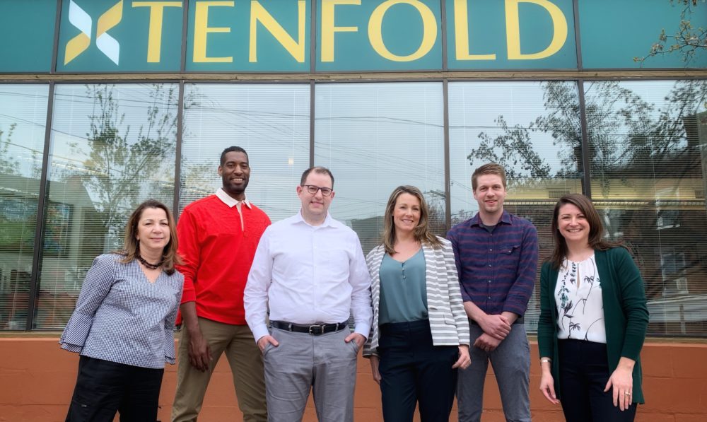
A special shout out to the following team members from Tenfold and Fig Industries who collaborated closely to bring our new Tenfold name and brand to life!
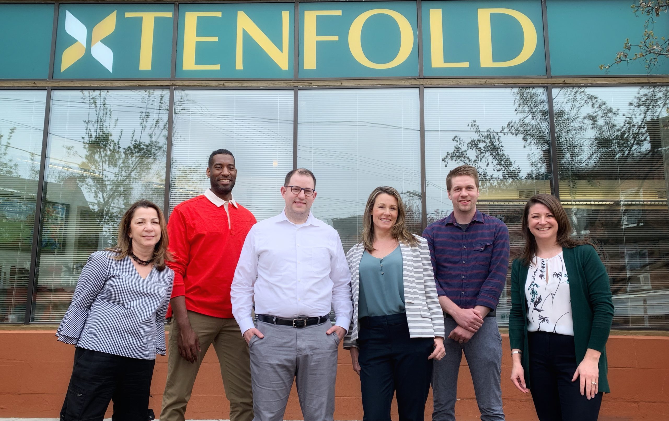
Pictured left to right: Lisa Side (Account Director, Fig Industries), Jason James (Art Director, Fig Industries), Mike McKenna (CEO, Tenfold), Shelby Nauman (Chief Impact Officer, Tenfold), Nate Lammey (Development Manager, Tenfold) and Stacey Karshin (Director of Communications, Tenfold)
Not pictured: Deb Brandt (Creative Director and Owner of Fig Industries) and Andrew Finley, (former Account Manager, Fig Industries)